Design Case Study: Lantr
Designing decks you actually present.
Co-founded. I led design, the iOS and macOS apps, and the AI system; a co-founder built Android and Windows. 2025–2026, now sunset.
The bet
Slides were meant to support a speaker. Somewhere along the way they became the presentation, and the speaker became the person reading them aloud.
Lantr started from one stubborn belief: you build the story before you're allowed to build a single slide. What follows is what that belief cost me, and what it bought.
Who it's for
Not the person assembling a quarterly board deck. The person who has to stand up and say something real, and knows the bullets won't save them.
I was that person. In 2022 I walked onto a pitch stage having rehearsed every comma of a deck, opened my mouth, and remembered none of it. I lived. And something I'd been afraid of turned into something I went looking for.
One talk, two zoom levels
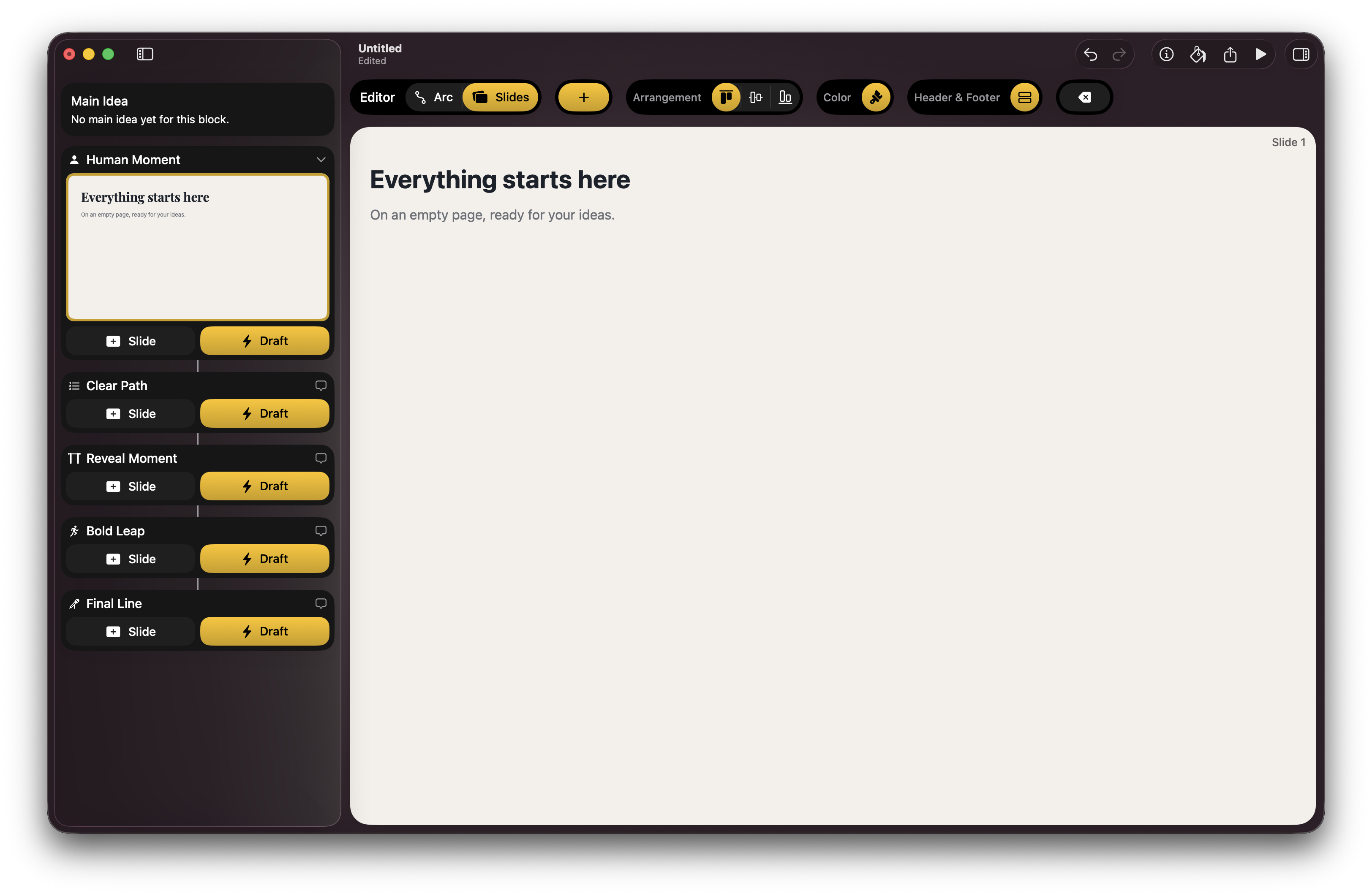
The workspace held two canvases, the arc and the slides. Two levels of zoom over the same talk. Zoom out to the arc and you saw the narrative: story blocks in sequence, the shape of the whole argument. Zoom in to the slides and you were inside a single beat, building the slides that lived within that story block.
Same talk, two altitudes. Slides couldn't drift free of the arc; they existed inside the story blocks that composed it. Story before slides was never a rule I asked you to follow. It was the geometry of the workspace.
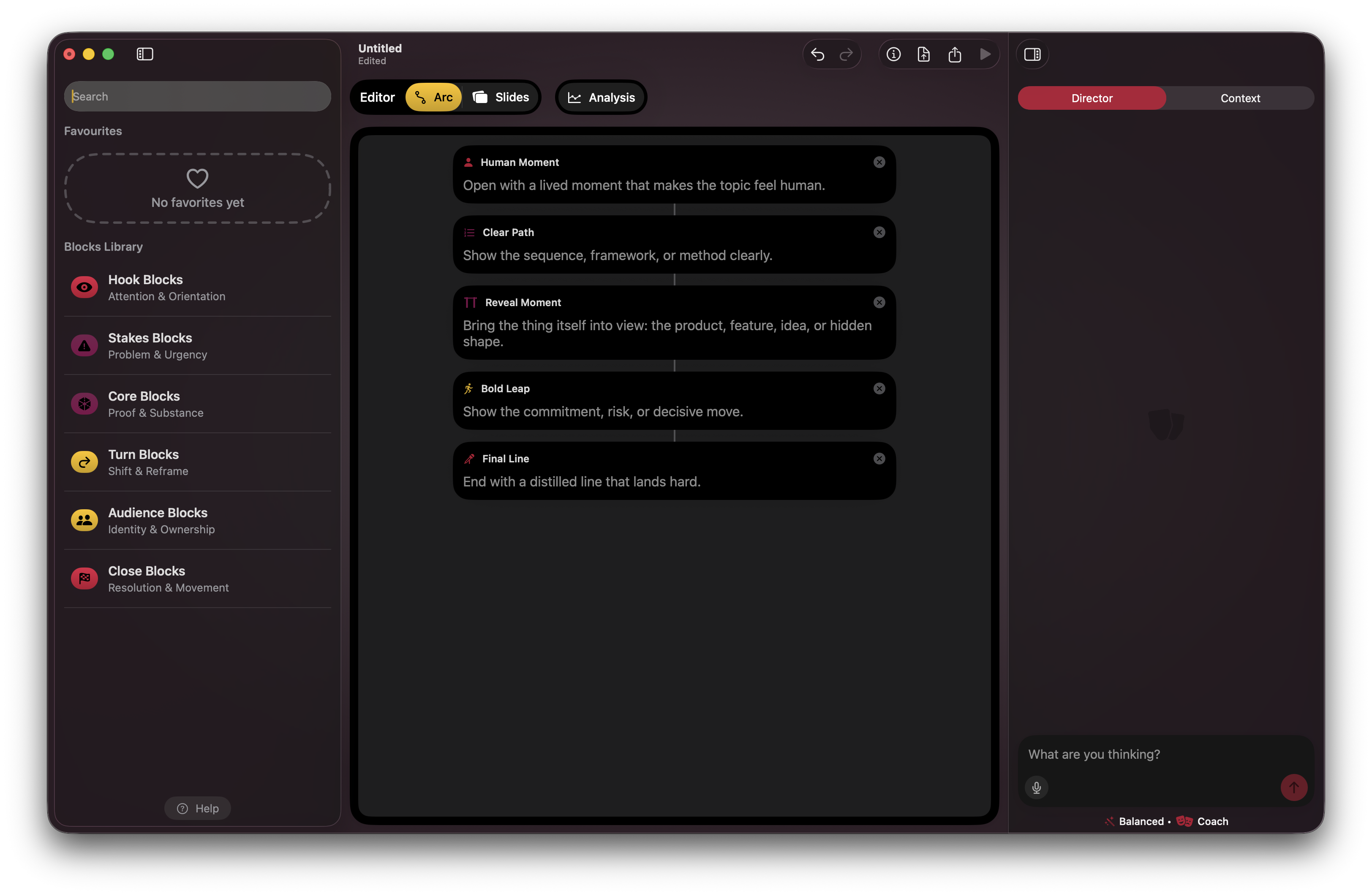
A preflight opened each new document. What are you presenting, to whom, and why. Just enough to give the AI context and me a moment of clarity before the blank page. Underneath, every story block carried ethos, pathos and logos values, so the agent could read the whole arc and tell me where it tipped: all logic and no stakes, all credibility and no heart.
How it landed. The idea hit. An engineer who tested it called the arc and story blocks “something I've never seen before,” and said she loved it. A student: “I've never experienced preparing a presentation like this.”
But the model that made it powerful, arc and blocks and slides nested inside them, was the exact thing people couldn't operate alone. How do I order the blocks? Turn them into slides? What's a “wildcard,” what's an “analysis”? A US NGO director hit the audience input head-on:
The ‘Their Mindset’ question I don't really understand. I'm not sure what I'm supposed to do with this.
The structure was obvious to me. The interface didn't teach it.
What I changed, twice. The first preflight was a six-step wizard. I cut it to a single screen with three folds that opened as you typed, so depth arrived when you reached for it instead of all at once. Progression at your pace, not a wall of fields.
It still wasn't enough. Three folds is fewer than six steps, but it's still a form, and a form is still an errand standing between you and the thing you came to do. So the third version asked for one click.
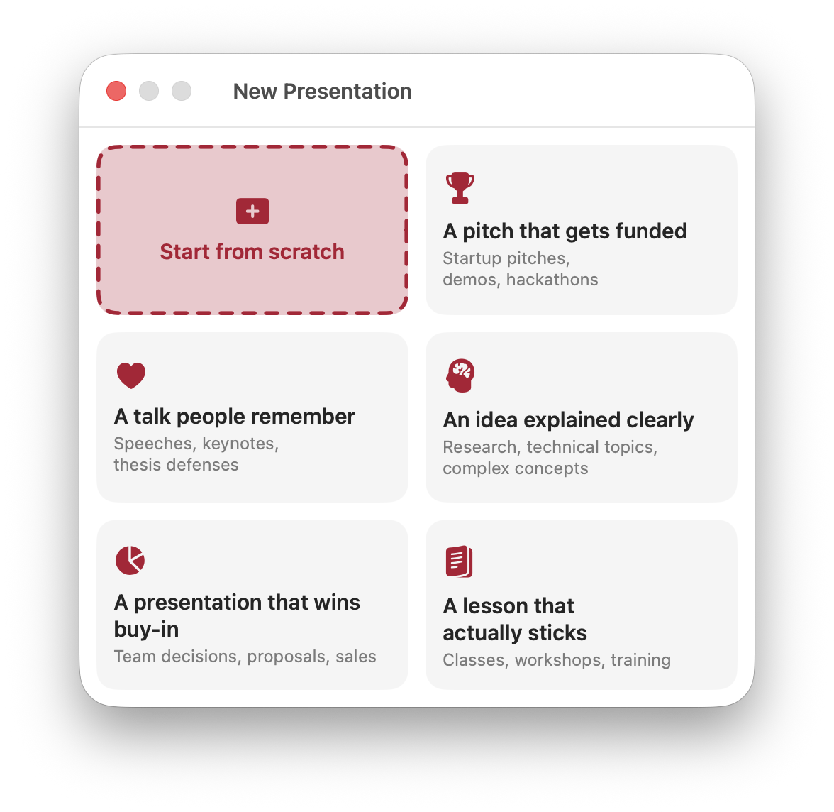
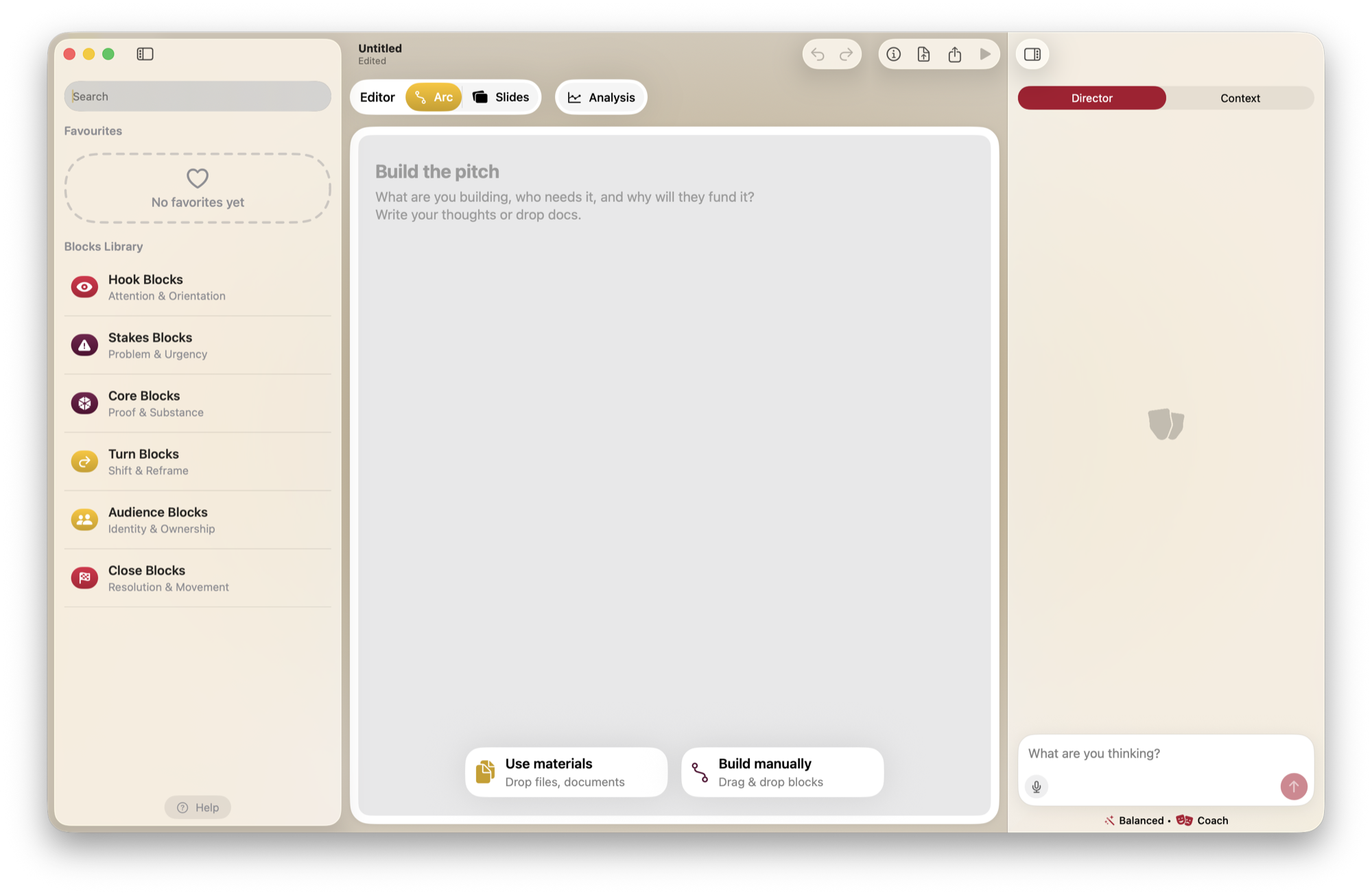
Naming the outcome wasn't filling in a field, it was setting the room. Pick “a pitch that gets funded” and the canvas opened already asking the pitch's own questions: what are you building, who needs it, and why will they fund it. The six steps didn't get deleted so much as moved, onto the page you were about to write anyway.
One obvious path, not a crossroad
The blank canvas is where a tool like this dies. The hard problem was never the slides. It was the jump from a head full of loose thought to the first structured block.
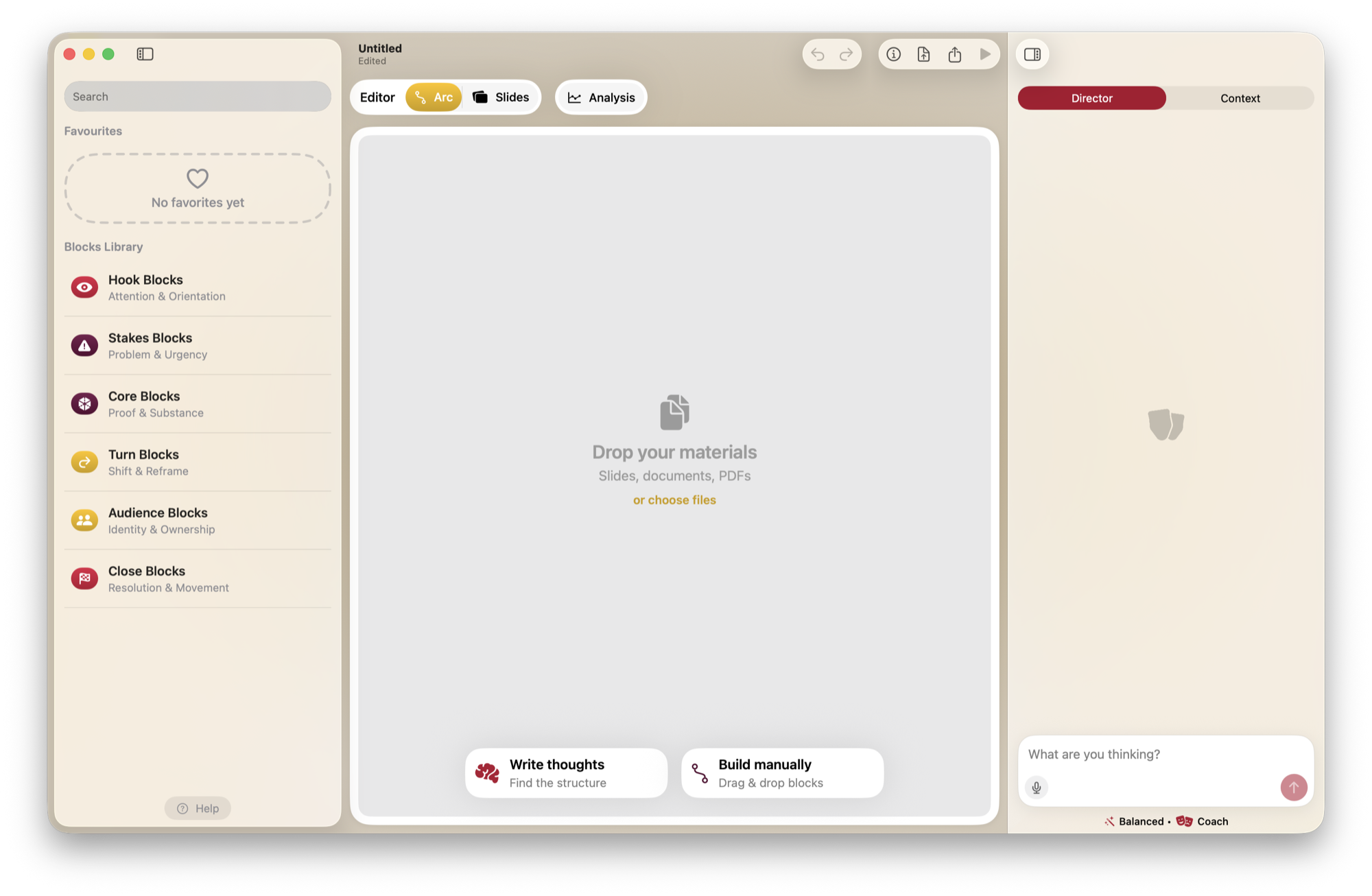
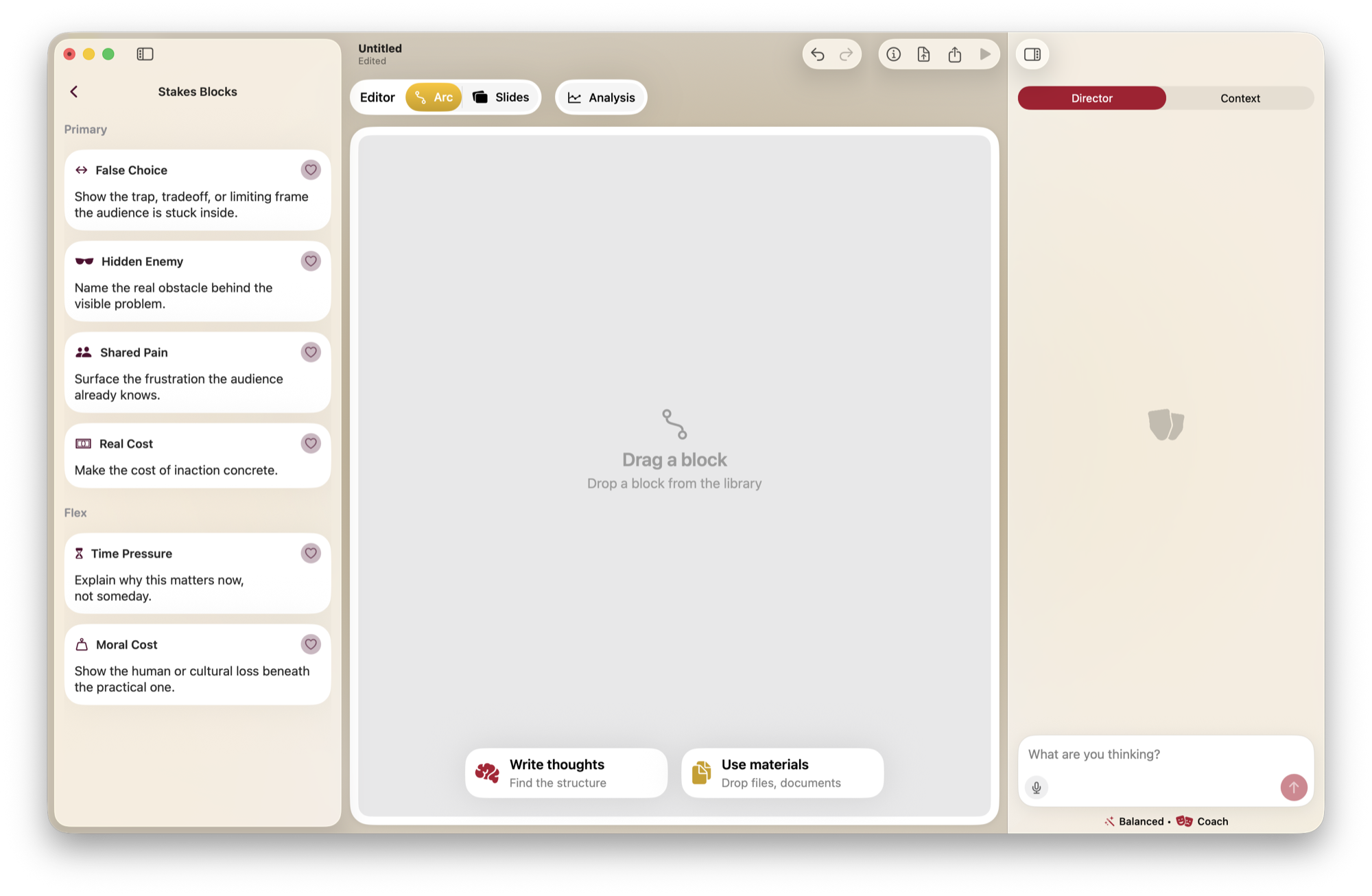
So I built a bridge for that crossing: dump raw text, drop in a document, build by hand, or steer the agent from the sidebar. The rule I held onto: it should feel like one obvious path I can wander off and explore, not a crossroads where every option looks equally uncertain. Choice, without the paralysis.
Whichever path you were on took the whole canvas. The other two waited at the bottom edge, one click away, and swapped places with it the moment you changed your mind. A path you can step off, never a fork you have to solve.
The canvas isn't a slide
Where you wrote behaved like a Notion page, not a slide editor. You stacked blocks; slides were built from them. On purpose, the canvas itself wore no theme; only the rendered slides did. Content and look stayed separate, so reordering your thinking never meant restyling it.
Presenter notes lived right in the block stream, just left out of the render. Everything is a block. You decide what the room sees.
What I got wrong
The app opened with curtains parting across the whole screen. I meant it as theater, fitting for a tool about performance. The NGO director read it differently:
I had an OH SHIT moment where I thought I'd downloaded something nefarious.
I'd still open with the curtains. A tool about performance ought to behave like one. What it needed was a door: an obvious skip, sitting there from the first frame. Spectacle you can step out of costs the viewer nothing. Spectacle you're held inside is where the trust goes.
Theming was my most honest failure, and it broke in two separate places.
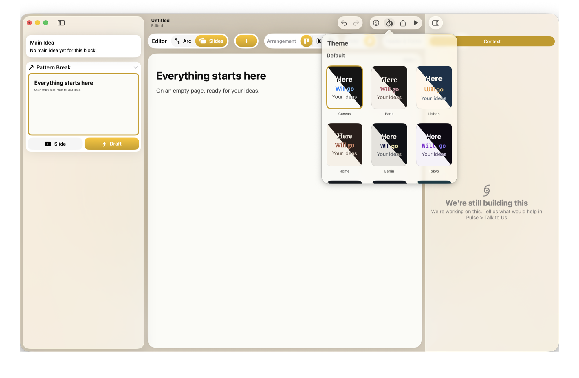
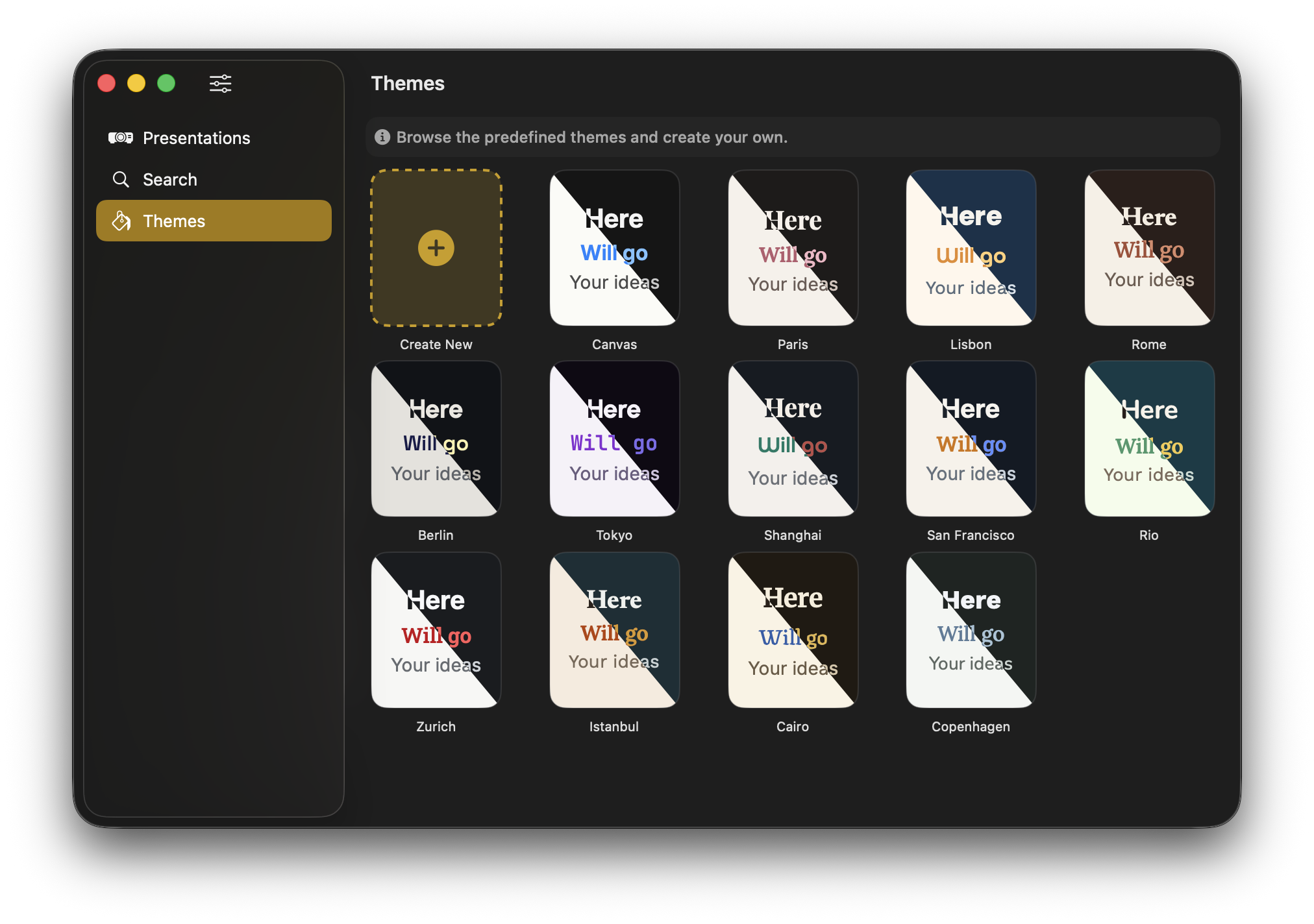
First the document themes. I shipped thirteen city-inspired presets, and a student found them constraining and strange to work with: he couldn't change a font or a size as he went. Picking a city took the type decisions off the table for the rest of the talk. I added color escape hatches for overrides, but the text styles stayed locked.
Then the app itself. An engineer looked at the colors of the actions and buttons, the interface rather than anything you'd ever project, and called it:
Everything's kind of red, no real cohesivity. The colors don't make sense why they are what they are.
He was right, and the same thing sat under both failures: styling that was assigned rather than meant. Color that means something instead of color that's merely there. If I built it again, theming would be semantic from the first line, in the document and in the interface.
In their words
-
The AI part does wonders, useful for when you can't find the right words for what's on your mind.
student -
Scripting a presentation with block-based things is clever.
engineer -
This is going to make me think about things differently. Putting the arc first is an interesting change.
NGO director -
It felt a bit overwhelming at first; a short tutorial would smooth it out.
student -
Semi-niche, but it does what it wants to do pretty well.
engineer
Why I stopped
The NGO director came wanting to import a board deck and left realizing Lantr wasn't that. It's a tool for speaking, not for formatting slides. He wasn't wrong, and neither was the engineer's “semi-niche.”
Lantr was a beautiful thing for people who present twice a year. Building for people who present twice a year is a hard way to build something that lasts. Seeing that clearly, and stopping, was the last design decision I made.
What I carry forward
The strongest ideas are the ones that ask someone to rethink a habit. The whole job is making that rethink feel like an invitation, not a wall. Lantr got the first half right on the first try. It spent the rest of its life on the second.
The argument underneath it: How PowerPoint stole the stage. The experiment that came after: Spoken Slides.